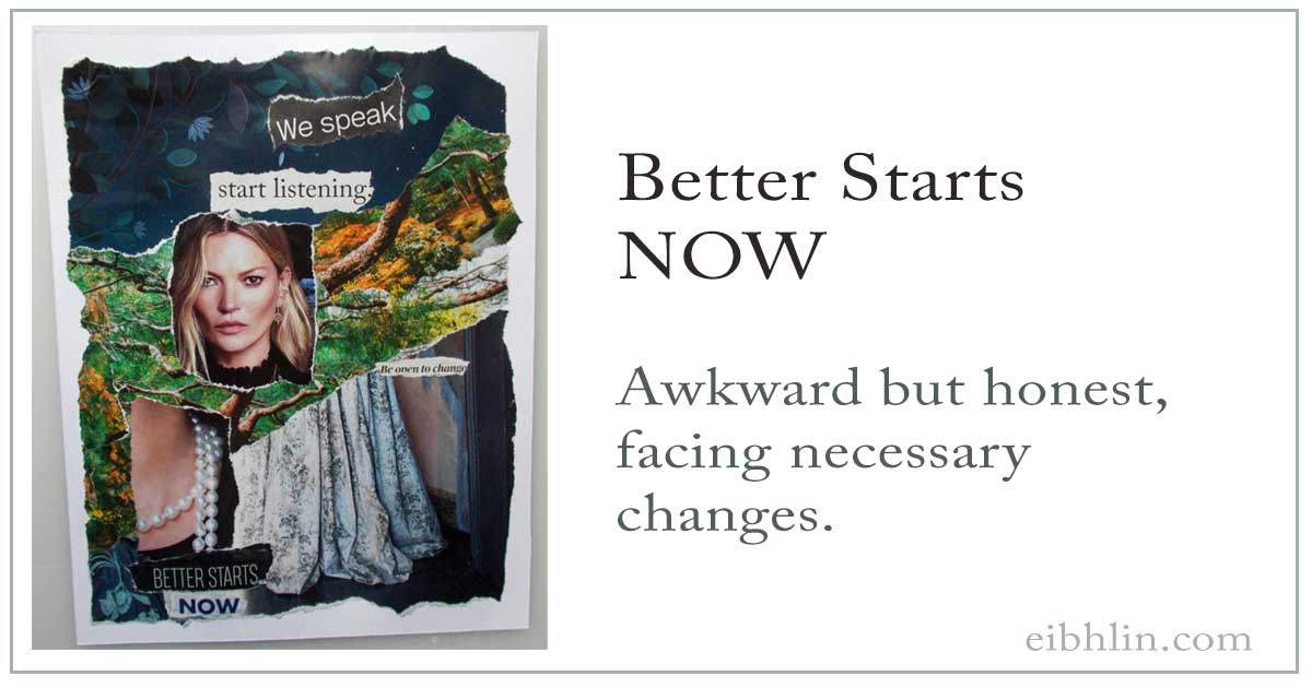
Most of my collages flow almost effortlessly as I create them. This one challenged me at several points.
Sometimes when I work, I lay out all of the pieces before I start gluing them in place.
At other times, I glue pieces as I tear them to size.
Most of the time, it’s a little of both. That is, I look at part of the collage and know that I love it, so I start gluing those pieces in place. I’m trusting the rest of the pieces to fit in place – and look good – as I find and tear them.
This collage was one of the latter, and – at a certain point – I wasn’t certain I could complete the piece. (Now and then, one just doesn’t work. I put it aside in case it “sings” to me at a future time. <– When a piece works, I’ll often talk about it “lighting up” or “singing” to me. I don’t actually hear anything; it’s just a feeling that the piece works.)
In this case, I liked the text lines at the top of the page, and the blue background beneath them. I liked the power in the model’s face, and I knew I wanted the brocade gown* in the lower right. So, I glued all of them – except the face – in place.
For the next hour, I shuffled a variety of “maybe” collage elements, until I glommed onto the magazine ad with the forest-y images. That’s when I said aloud, “Right. Mother Nature.”
With those pieces glued in place, I knew “Be open to change” had to be part of the message.
And then… I stalled again.
When the pearl necklace got my attention, I was back on track. For me, that image is about women’s power. Pearls have always seemed an iconic sign of quality and quiet strength. (I still have the pearl necklace my mother gave me when I was around 12.)
Then, the words “Better starts” leaped off the magazine page, and… I stalled again.
When I found the word “NOW” in an article headline, I knew it was exactly right.
But… I’ll admit I completed the collage with some uncertainty. It had been through so many changes, I wasn’t entirely certain what the work meant, if anything.
This morning, looking at it fresh, I’m very pleased with it. It’s exactly what I wanted to say. I just didn’t realize it until the piece was completed, and I had some mental distance from it.
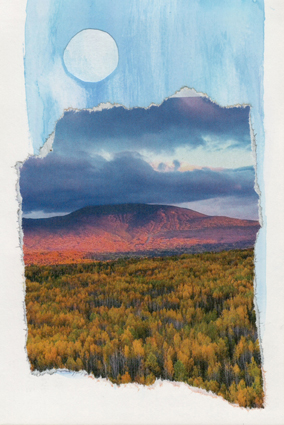
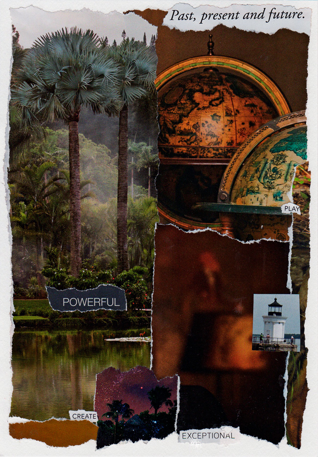
Size: 8.5″ x 11″
Materials: Torn magazine pages, Yes Paste, and acid-free art paper.
*The brocade gown element remained from my work on a recent piece, Now Is The Time. In that collage, the related brocade element is at the lower right side.

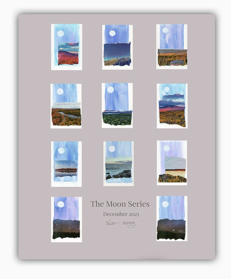 Prints and posters of this installation are available at Fine Art America.
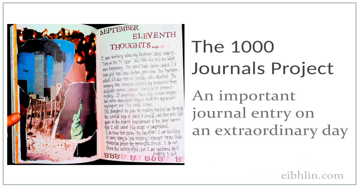
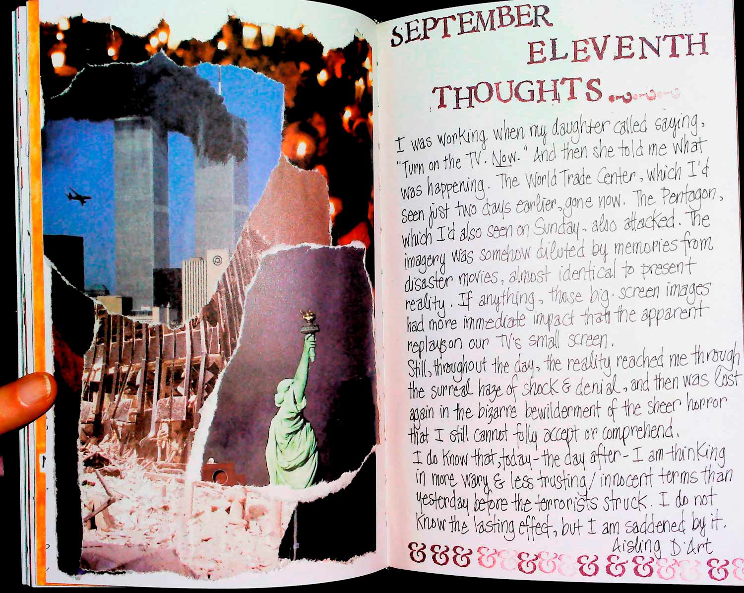


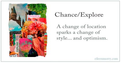 Here’s what I wrote when I created this art: