Door Gallery – Sharing Art

For the past few years, I’ve regularly featured art on the front door of our home.

I’m not sure how many people actually see it, but it’s my way of adding original art to a world that sometimes lacks originality.

I believe that art has an authenticity that can only be appreciated when it is viewed up close and in real life.

Here’s one of the collages I displayed on my front door. You can read about it at Now is the Time…Artist’s Notes.

Torn Paper Collage - Now Is The Time

Sometimes, I change the art daily. Sometimes weekly. Now and then, I may leave a statement piece – art with a strong message – on my door for a few weeks. It varies with my mood, as well as my schedule.

Here’s some other original art – with messages hoping to encourage neighbors in challenging situations – that I’ve displayed on our front door:

Adversity - door sign Cant be good


Creativity quote - Steve Jobs Enjoy what you're doing


Of course, what I display also varies with my mood and the creative project I’m working on.

Not long after, I saw an article about another artist with an even better idea, her Little Free Art Gallery.

That’s not entirely practical where we live, but I love the concept. I may create my own version at our next home… wherever that is.

But mostly, I’m always looking for ways to share original art – in real life – with lots of people in unexpected settings.


Charlie Brown-ish Christmas Tree

This year, we chose some real, alternative Christmas tree options.

We had two trees in our living room. (I’ve always preferred to have more than one tree for the holiday season.)

One “tree” was actually a bunch of small branches, arranged in a large glass jar, so they looked like a small Christmas tree. I’d picked up those branches at a nearby Christmas tree lot, where they had a stack of extra, odd-shaped branches in a pile to go to the trash.

We decorated that arrangement with all the normal Christmas-y things, including a lot of small, sparkly, multicolored ball-type ornaments. The size suited the small scale of the tree design.

To visitors, it looked like a normal, small (2 – 3 foot tall) Christmas tree.  We liked re-purposing discarded branches to create it.  It felt very “green,” on several levels.

Our “Charlie Brown” Tree

Our other tree involved some serendipity.

Charlie-Brown-style Christmas tree - 2012 EibhlinI was out for a walk, and noticed a wonderful, large branch by the side of the road.  It was about four feet tall, and I think it had been pruned from someone’s pine tree.

I brought it home and found a really large, gold, globe-type ornament to hang on it.

(It drooped, naturally.  It’s the way the branch had curved on the original tree… it’s not sagging or anything.)

The effect was almost exactly like the little tree in the Charlie Brown Christmas Special.

I propped it against the wall, in a shallow bowl of water.  It lost absolutely no needles during the holidays, and it’s still pretty soft & flexible, now.

This afternoon, I’m taking this little tree and our jar of branches to the nearby woods, so the branches return to nature.

These were among my favorite Christmas trees ever, and no trees were killed (or money spent) to enjoy them in our home.

I think this is the beginning of a tradition in our home, and it just sort of happened this year, all because I wanted a couple of small trees that fit the size of our apartment.

The Beauty of Cleaning

One of the best things about being an artist is the beauty I see everywhere.

When I was cleaning one of my palettes this past week, the running colors were so gorgeous, I had to capture them with a photo.

(Note: I paint with water-soluble oil paints, so I can clean them in the sink without toxic cleaners such as turpentine. My cleaning product of choice is Incredible Pink, a biodegradable general cleaner from Maine.)

The photo shows my palette in the sink. The picture was taken without a flash.

From left to right on my palette, here are the colors I routinely use for my paintings:

French ultramarine blue
Alizarin crimson
Cadmium red
Cadmium orange
Cadmium yellow
Lemon yellow
Pthalo blue
White (sometimes Zinc white, sometimes Titanium white)

I also add Sap green and/or Burnt umber for some paintings.

Of course, in the photo above, you can see the residue of lots of mixing on every square inch of the palette.

In a way, this is art, all by itself.

Testing a New Drawing Pen

ATC - an umbrella sketchBefore renewing my love affair with pen & ink illustration, I needed a new rapidograph.

Since childhood, I’ve always loved black-and-white illustration, and my drawings are a mix of contour-style line drawings accented with cross-hatch (etc.) shadows.

My “people” have always been silly-looking things with large noses that often extend directly from the hairline and either amused or perplexed expressions.

When I first stumbled onto illustrations by Edward Gorey, I knew I’d found a kindred spirit.  Though his writing themes are far darker than mine, I got his artwork.  I’d filled notebooks with similar drawings; they were created during high school study halls when others were either working on homework or passing notes.

Though I used a traditional crow quill pen (and ink well) during my teen years, I discovered rapidographs once I went to college.

Today, they’re sometimes called rapido sketch technical pens and I’m currently using a Size 0 (zero) point.

My newest ATCs

As I was breaking-in my new pen, I wanted to create a series of ATCs.  (Artist Trading Cards are usually 3.5″ x 2.5″ mini-works of art.)

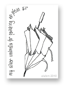
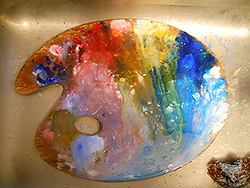
The first was a drawing of my painting umbrella, shown above.  The umbrella has a silver top and vents to keep me cool when I’m painting outdoors on summer days.  The lining is black, so reflected light doesn’t affect the color of my work.

The next ATC was a sketch of our living room fan, shown on the left.

We keep this fan by the patio door, to bring in cooler breezes when summer days are a little too warm… but not hot enough to use the a/c.

The tricky part of sketches like these is knowing how much detail to include and what to leave out.

I’m not sure I got it right with this card, but these were just for practice, anyway.

In retrospect, I probably wouldn’t do so much cross-hatch style shading on the fan’s support.  However, that exercise helped me with a later card, and I try not to get stuck in making everything just so.

Perfection is one of those traps for me as an artist. If I get bogged down trying to improve my work to an unachievable standard, well, I stop making art after a while. So, I try to remember what’s “good enough” when I’m working.

The next ATC in the series was a little trickier, at least in perspective and detailing.  It’s my husband’s desk chair.

When he’s not sitting in the chair, he leaves a folded piece of flannel fabric on the seat. That’s to provide a softer surface for our cat, George, to sit on and to keep some of the cat hair off the chair.

So, I was once again faced with the question: How much detail should I include?  The flannel is plaid and has ragged edges; I left out the former and included the latter.

The sketch isn’t perfect (ah, that word again!), but it’s good enough.

My next ATC was based on one of my favorite scribbles from junior high school and later.  I used to draw these in the margins while taking notes in boring classes.

Though some elements are reminiscent of Peter Max’s art, I drew these before he became popular.  Several artists of that era drew from popular and iconic 1960s art and illustration.

In some cases, I’d color these kinds of drawings.

One eventually became a huge work of art that decorated three walls in an elevator of a Marlborough Street apartment in Boston, Massachusetts.

Later, one became a massive mural for an office just outside Salt Lake City, Utah. It could be seen from the street through a huge plate-glass window. I was tremendously proud of it.

Both were full-color paintings, usually featuring vivid crayon-box colors.

My next ATC is a nod to my high school art teacher, Roger Mulford.

One of my best friends (and classmates), Laura Whipple, and I both drew flowers for a class assignment. Like me, Laura favored pen-and-ink drawings with lots of detail and sometimes “dotty” shadowing.

Roger called it the Morey-Whipple (or Whipple-Morey) style of art. We thought the name was pretty funny.

(Roger had always been a somewhat renegade teacher, insisting that we call him by his first name.  When the school insisted that he had to be “Mr. Mulford,” he retaliated by calling us “Miss” and “Mr.” with our surnames, so we were still all on equal footing.)

Spalding Inn, Whitefield, NH with UFOMy final ATC in this series was a moment of whimsy. It represents the skies over Whitefield, NH.

The Inn is on the general path described by Betty and Barney Hill, the first Americans to report an alien abduction.

They talked about the route the UFO followed, over their heads as they drove south on Route 3 from the Canadian border to around Exit 33 (off Rte. 93) where they were abducted.

The UFO overhead may not be realistic, but… well, it’s fun.

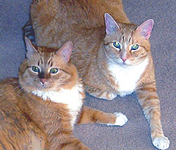
And, for animal lovers, here’s our cat, George. He’s the one on the left. His brother, Tom, is on the right.

George and Tom

Disneyland and My Mother’s Art

Disneyland's Fantasyland castle - artwork by Muriel Bernier, ca. 1955As I’m writing this, Disneyland is celebrating its 55th anniversary. I grew up surrounded by Disney art, figures, and I watched the Mickey Mouse Club every time it was on.

I’m commemorating Disneyland’s anniversary with an artistamp.  It features art by my mother, Muriel Joan Bernier (1919 – 2010).

Click on the image to download a PDF copy of the actual stamp (smaller than illustrated).

If you’re not sure what an artistamp is, you can learn more at my other art website: Artistamps – Definition at Aisling.net. (Page will open in a new window.)

The artwork at the upper left, which was also on the Fantasyland board game, was my mother’s original art*.  She freelanced for Disney in the 1950s, and I remember her drawing this picture and many others for Disney.

Fantasyland board game - artwork by Muriel Bernier

(The cover of the Fantasyland board game, above, and the actual board shown below, are entirely my mother’s artwork.)

One of the best benefits of growing up with a mom who drew for Disney is that we’d go to the Disney movies over & over again.  My mother would sit next to me, with paper and pencil, and she’d sketch ideas for new artwork as we watched… well, whatever Disney movie was at the theatre that week.

Fantasyland game board - artwork by Muriel Bernier

My mother created all the artwork for the Fantasyland board game, and most of the artwork for the Steps to Toyland game, also a Disney-related theme.

Steps to Toyland - artwork by Muriel Joan Bernier
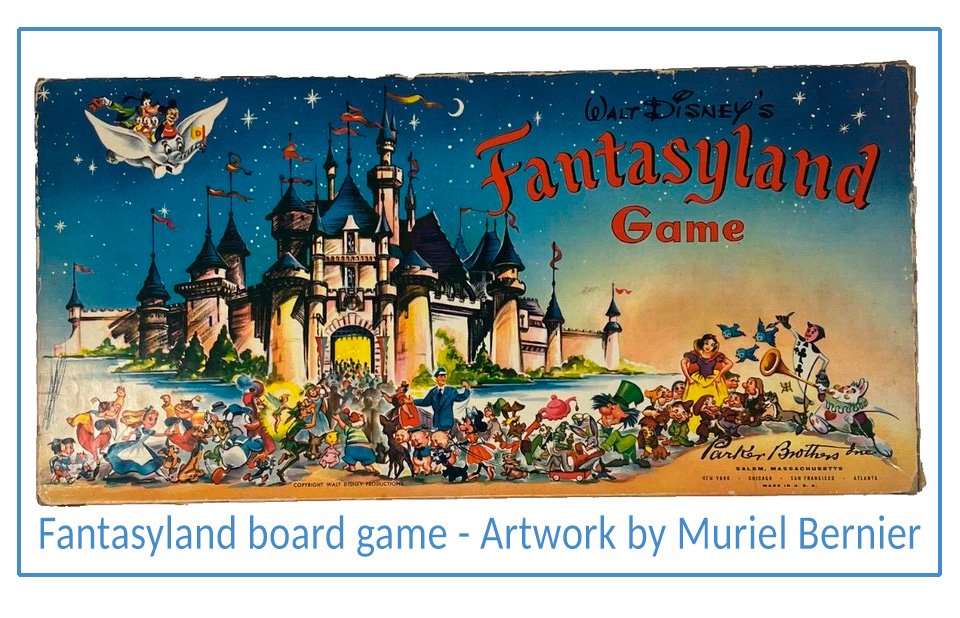
(Scanned from a vintage Parker Brothers Game catalogue)

Though Mum did lots of artwork for Disney, her first actual visit to Disneyland was with me, in 1978.  She loved it.

I remember asking her what her favorite attraction was, and she answered without hesitation, “Space Mountain… and I will never go on it again!”  Then, she laughed.

In the late 1980s, Mum visited Walt Disney World with my children and me.  We had several days there, and stayed at the top floor of the Contemporary Resort.

We went on nearly all the rides, but – as Mum said – she wouldn’t go on Space Mountain again.

Every moment was great and filled with awe.  For us, there’s no such thing as “expecting too much” at Disney World.

My mom passed away earlier this year, and she didn’t want me to post her artwork online.  (My mother’s always been eccentric.  Once she decides something, she rarely changes her mind.  Questioning her about it… well, it was pointless.)

This, however, gets around that.  The images shown above – including the artwork for my artistamp – were already online… just not credited to her.   I know she’d be irked if she realized that her artwork was displayed without acknowledging her as the artist.  So, if anything, this corrects that.

So, here it is as an artistamp.  Ordinarily, I add my artistamp postal name – Ballynafae – and a postage amount (usually 3p) to make my artistamps look more stamp-like.  In this case, it didn’t seem right, so I added the basic text and here it is, as-is.

You can download my artistamp as a stamp-sized image, either with a stamp-like edge (as a graphic), or as shown at the top of this post.  (Both of those links open as PDFs.)

I still miss my mom, but moments like this bring back happy memories of an extraordinary childhood.

…Wherever you are, Mum, your artwork is still bringing smiles to Disney fans.  Thank you for such wonderful memories!

*My mother was primarily a painter.  Though she graduated from Massachusetts College of Art with a major in Portrait, she loved painting landscapes and still life subjects.

Writing and the Creative Process

empty frameThe following is edited from my post for writers in a private, online forum.

It also applies to art, in general.

I’ve worked as an editor.  The greatest tragedy is to see a first draft of a book that was raw and full of creative energy, but then… the “polished” draft that the author sends is technically better, but it’s lost its energy.

It won’t sell. If it earns any reviews, they’ll use words like “lackluster” and “disappointing.”

(If this doesn’t make sense to you, think of all the rock bands you loved when they were new and fresh and raw.  Their later work is more technically perfect, but it’s lost the energy.  It sounds derivative.)

The first version of your book might need a few tweaks, but it had a spark.

That’s what ignites enthusiasm in most readers.

So, don’t edit as you go along.  80% of the time, your book will reach the finish line and need just minor edits.

You may not be able to see that, clearly, when it’s in progress.

Monet’s paintings didn’t look like photographs.  His fifth-grade art teacher would probably have taken his pencil away and told him he didn’t get the number of windows right in his cathedral paintings.

Copland’s music, “Appalachian Spring” doesn’t have any birds in it.  Not really.

Like Monet’s work, it’s his impression of something worth sharing with others.

Hold your writing to a creative standard, not to some level of supposed perfection that you inherited from some English teacher, or a voice in your head that insists you need to “try harder.” (Seriously, in the arts, that phrase probably needs to be banned.)

Your unique voice makes a book great, far more than technical perfection. The energy you convey is what matters. It’s practically your signature.

You get your spark of energy from the initial idea.

Keep that spark alive. Don’t choke it with editing as you go along.

And, at least when you’re a struggling writer, don’t share your ideas — or your unpublished books — with others. Too many will eagerly shovel fertilizer for self-doubts onto what’s best about your work.

Be uniquely you.  Use every tool you can to maintain that unique voice, and keep the creative spark alive.