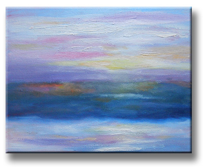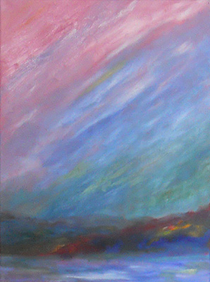
As an artist, this is interesting. I feel as if I’m finding my personal voice in terms of influences: Impressionism v. Tonalist & Luminist art. (Those links open in a new window and take you to Wikipedia.) For me, Impressionism includes apparently disconnected colors & textures (at least, up close) that create the visual and…
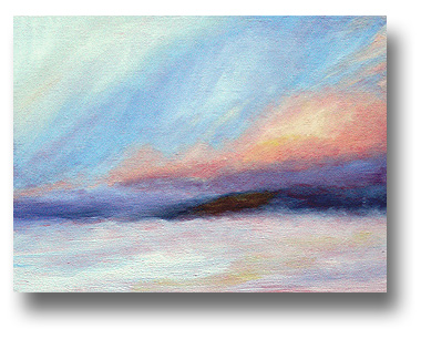
Tag: NH
Spring 2010 – Revisited
Sometimes I look at an older painting and it’s lacking something. Oh, it’s often “nice enough,” but… well, that’s not enough for me unless it was just a quick sketch. My March 2010 painting, Spring is on the way, was like that. It just didn’t have the oomph that I wanted; that may be partly…
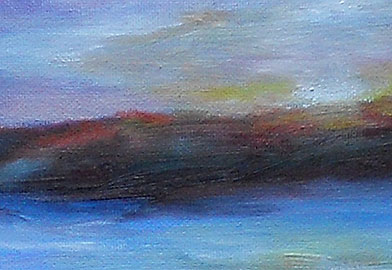
Orange Hills Revisited
This is an example of what happens when I look at one of my earlier sketches and all I feel is, “Well, it’s okay…” I started with the oil sketch from January 8th, the Orange Hills at Sunset painting. Frankly, I was going to put it into eBay at a low starting price, just to…
Sunrise – Snowy Skies – 14 Jan 2011
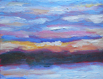
This morning’s skies looked ominous at first, and the colors were there for just a couple of minutes. I was glad that I’d already set out my palette with the colors I was likely to need. This was a small, fast oil sketch on an 8″ x 10″ canvasboard. Many sunrises feature the brightest colors…
Sunrises – Two More – 13 Jan 2011
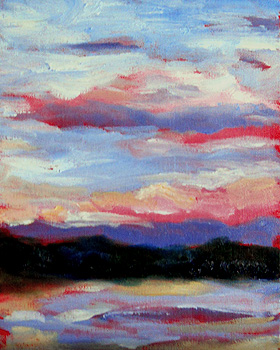
It was another sunrise with quickly-changing skies. I had to work very quickly to capture the colors on these two 8″ x 10″ canvasboards. The first one includes darker colors and higher contrast. (In real life, the reds aren’t that vivid, blue-ish, or light.) The sun was just coming up (in back of me) and…
Flurries at Dusk, Revisited – 13 Jan 2011
With some minor changes, the larger Flurries at Dusk painting is now completed. (See the nearly completed version plus backstory, here. Mostly, I added contrast in some areas, and softened the white areas in the sky.) It’s a higher key than I’d expected, but I’m pleased with the lyrical quality of the color. The completed…